
According to RIT's DeafSpace guide, what is the recommended distance between two people having a conversation in sign language?
Select one answer.
Why your event layout matters for Deaf attendees
If you're planning an event and want Deaf and hard of hearing attendees to participate fully, the room itself can be the biggest barrier. Standard event layouts often prioritize audio experiences and assume everyone can hear announcements, follow conversations, or catch what's happening on stage. For people who communicate visually, those assumptions create real problems.
Deaf Space is a set of design principles developed at Gallaudet University starting in 2005, with architect Hansel Bauman working alongside the Deaf community. The DeafSpace Design Guidelines include more than 150 architectural elements organized around five core principles: space and proximity, sensory reach, mobility and proximity, light and color, and acoustics. These principles were created for buildings, but they translate directly to event planning.
The five principles and what they mean for your event
Space and proximity
People using sign language need more space between each other than hearing people do. According to RIT's DeafSpace guide, conversation partners should be about 3 to 10 feet apart so both people can see hands and facial expressions clearly. At your event, this means:
- Avoid narrow rows and cramped seating arrangements
- Provide wide aisles so people can walk side by side while signing
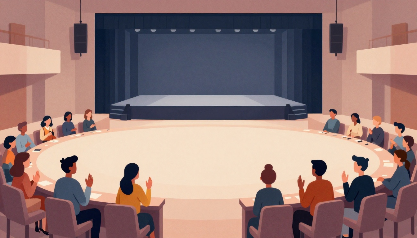
- Use round tables or horseshoe seating instead of long rectangular tables that block eye contact
- Leave open floor space where people can gather and converse comfortably
Sensory reach
Sensory reach means being able to see what's happening around you without relying on sound. For events, this translates to:
- Clear sightlines from every seat to the stage, screen, and interpreter
- Open layouts that avoid walls and corners breaking visual connection
- Mirrors or reflective surfaces in hallways and around corners where possible
- Avoid placing tall centerpieces or signage that blocks views
Mobility and proximity
When people walk and sign at the same time, they need wide paths and no sudden obstacles. For your event:
- Keep walkways at least 6 feet wide where possible
- Avoid blind corners; use rounded or open transitions
- Don't place furniture, planters, or A-frame signs in the middle of walking paths
- Make sure ramps and stairs are wide and shallow
Light and color
Lighting can make or break visual communication. Backlighting creates silhouettes that hide facial expressions. Glare causes eye strain. For events:
- Avoid placing speakers or interpreters in front of bright windows
- Use even, layered lighting instead of harsh spotlights
- Choose matte finishes on walls and floors to reduce glare
- Make sure the interpreter's face and hands are well lit
Acoustics
Even though Deaf attendees aren't relying on sound, acoustics still matter. Hard surfaces cause reverberation that can be distracting for people with hearing aids or cochlear implants, and it makes it harder for anyone to focus. Consider:
- Adding soft materials like fabric drapes or carpet where possible
- Positioning the stage away from hard reflective walls
- Using a sound system that's balanced, not just loud
A practical checklist for your next event
Before you finalize your floor plan, run through these steps:
- Walk the room as if you can't hear. Can you see the stage from every seat? Can you see an interpreter? Are there obstructions?
- Reserve front-row seating for Deaf and hard of hearing attendees. CNCF's conference best practices recommend reserved chairs in the front row and loose chairs near the stage for interpreters.
- Position interpreters where attendees can see both the interpreter and the speaker without turning their heads constantly. Deaf Services Unlimited notes that interpreters should be placed so Deaf attendees can see them and the speaker without strain.
- Check your lighting. Stand where a Deaf attendee would sit. Is the interpreter's face shadowed? Is there glare from a window behind the stage?
- Widen your aisles. If two people can't walk side by side while signing, your aisles are too narrow.
- Ask about access needs during registration. Make the question prominent and offer options like ASL interpreting and CART captioning.
- Budget for accessibility from the start. Don't wait for a request. Build it into your planning timeline.
Common mistakes to avoid
- Putting the interpreter off to the side. Deaf attendees shouldn't have to choose between watching the speaker and watching the interpreter.
- Using long rectangular tables for discussions. They make it impossible for everyone to see each other.
- Ignoring lighting until the day of the event. Bad lighting can't always be fixed on-site.
- Assuming one layout works for everyone. Deaf and hard of hearing attendees have different needs and preferences. Provide options.
How the Featured Expert Can Help
Unspoken Events Co., LLC is a Deaf-owned, women-owned, and disabled-owned inclusive event strategy and accessibility consulting firm based in Central Ohio. Founded by Heidi DeGrace, they partner with businesses, nonprofits, schools, and community organizations to create events that bring Deaf and hearing communities together. Their services include event strategy, accessibility consulting, and community connection. You can learn more at unspokeneventsco.com.
Test your knowledge
Take this quick quiz to check your understanding of Deaf Space principles in event layouts.